
1 / 8
Description
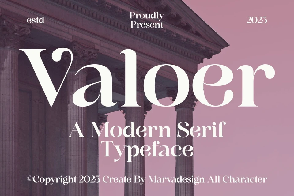
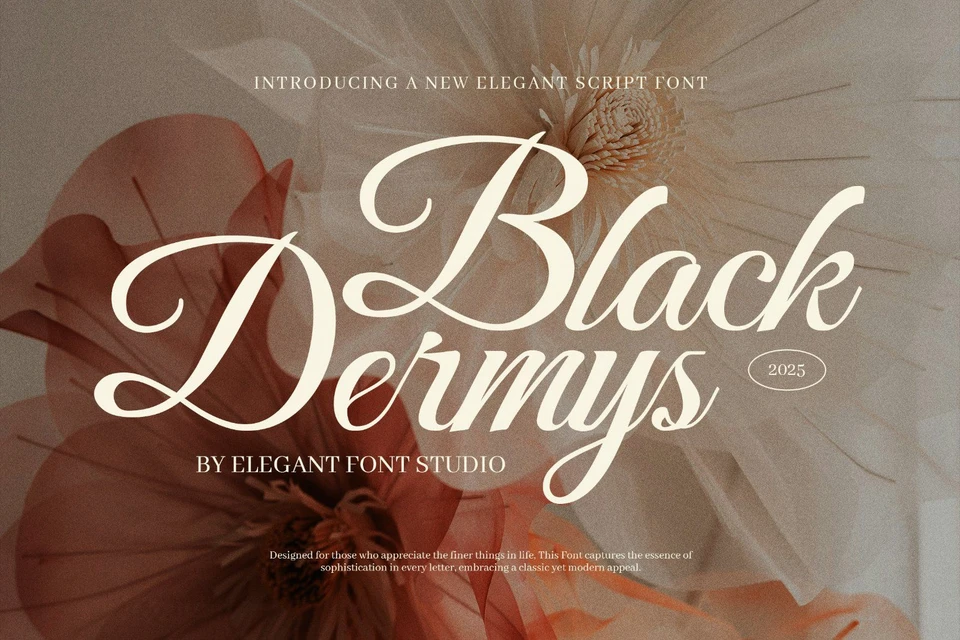
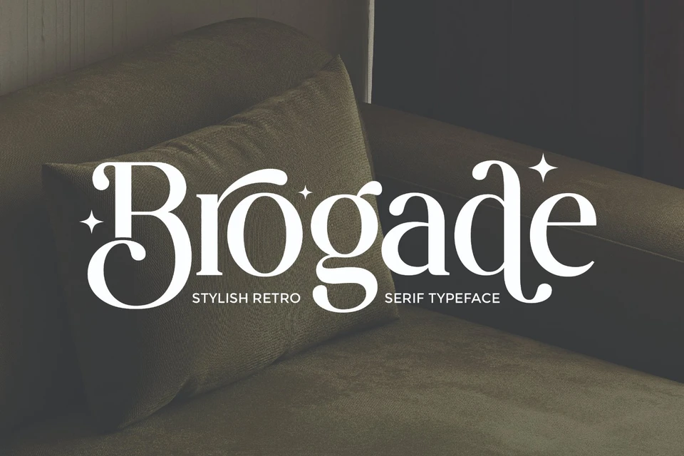
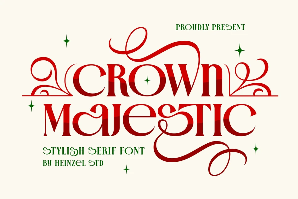
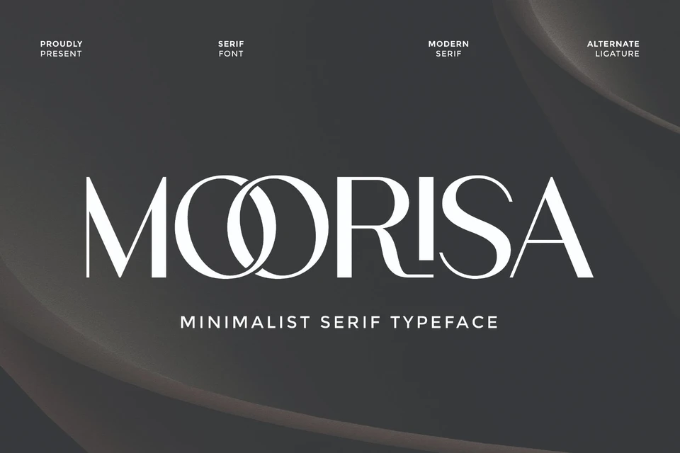
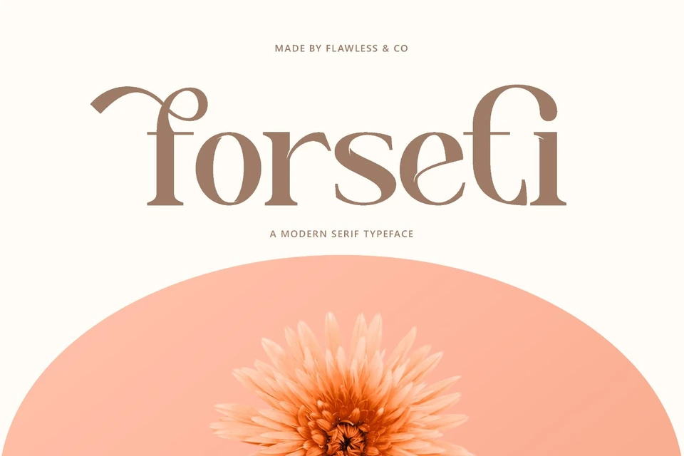
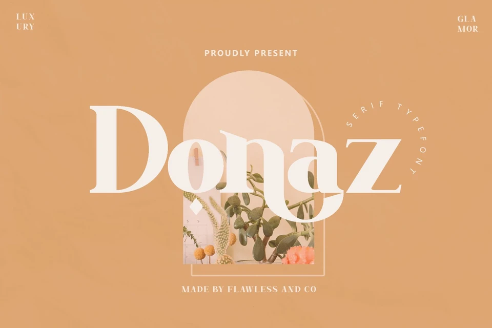
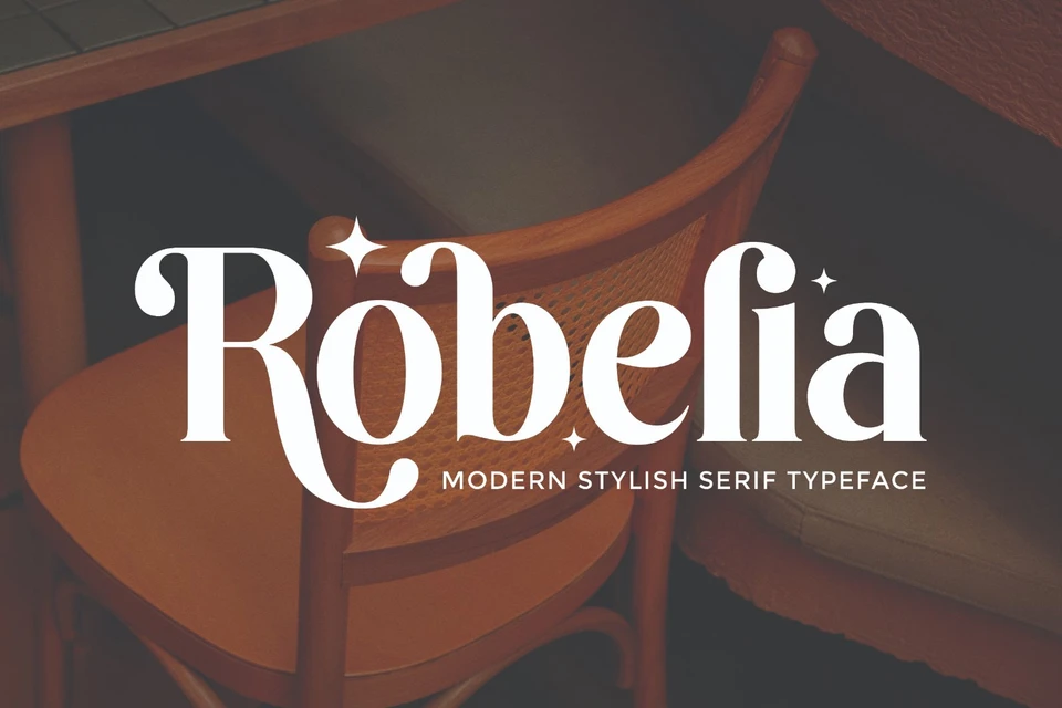
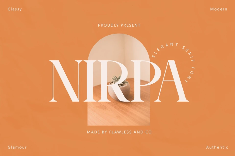
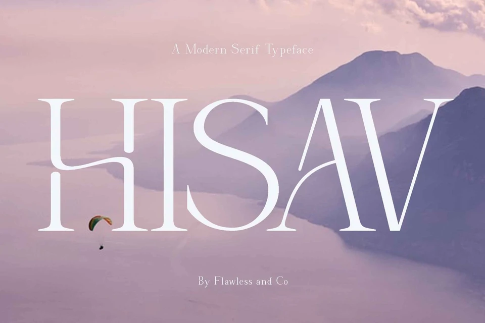
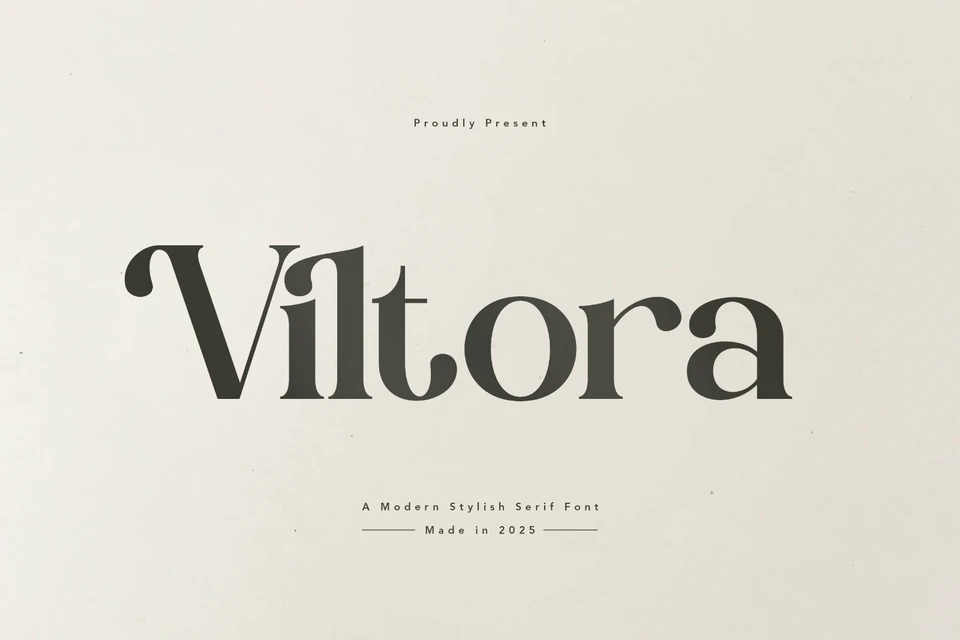
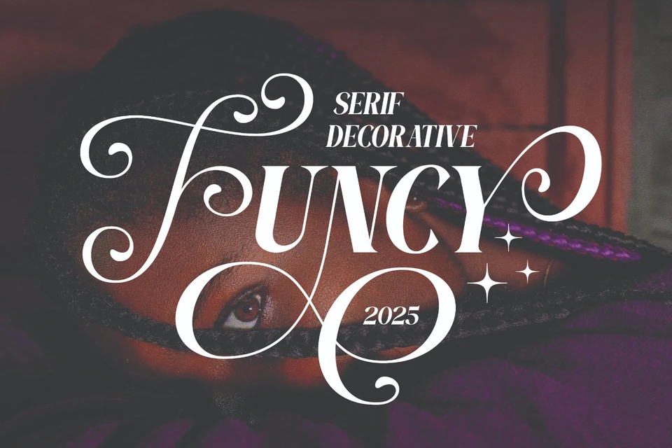
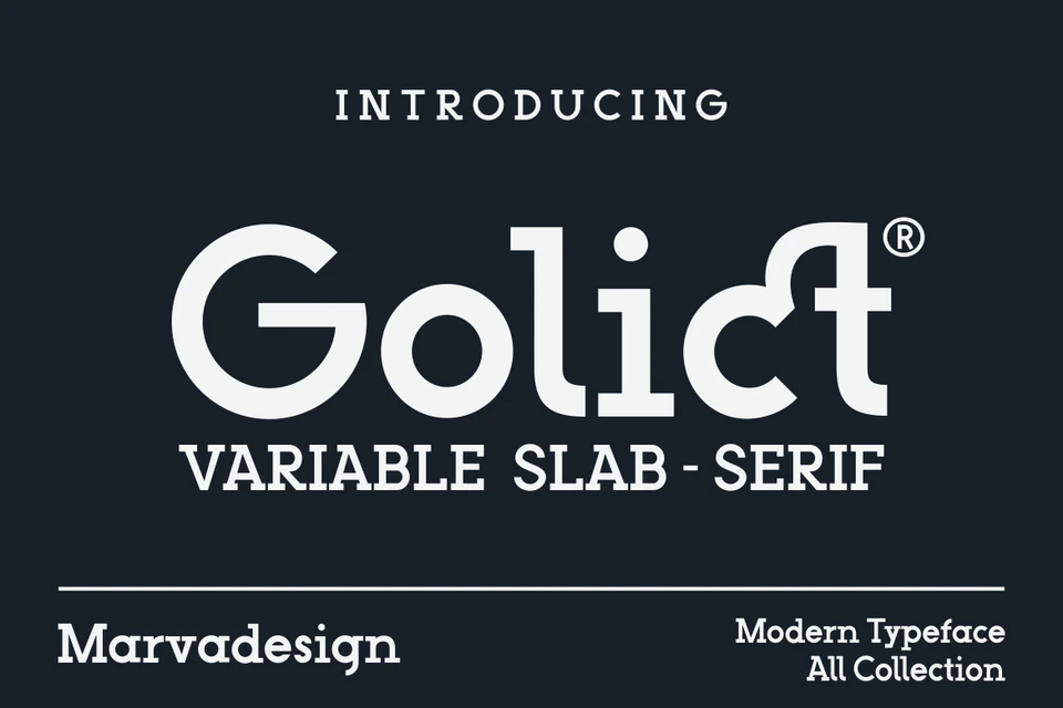
Bailse Serif tend to have fine serif details and well-proportioned proportions. Subtle serif details provide a classic touch without overly framing it. The balanced and proportional proportions of the characters create a neat and orderly impression. Moderate letter height ensures good readability without sacrificing aesthetics. The character can have a slight curve to add softness to the overall look. This font is suitable for use in titles, main text, or other large text in designs that prioritize a formal and classic impression.

Be kind and constructive. Sellers appreciate specific feedback.
No comments yet — start the conversation.


More like this
Picked from the tags and category of Bailse